Improving the Hiveage User Experience
Many cities and countries have been in lockdown for weeks now due to the COVID-19 pandemic. These are difficult times for all of us. Nonetheless, the Hiveage team, which has been working remotely for a couple of years now, is committed to ensuring the availability of our service for all small business customers around the world. In that vein, we look forward to using this time as an opportunity to launch some of the key improvements we have made to Hiveage, starting today with our user interface.

This update goes beyond the kind of incremental improvements to the UI we have made over the past few years. While retaining the layout of the web app, we have attempted to make it more elegant, intuitive and usable. Some of the notable changes are as follows:
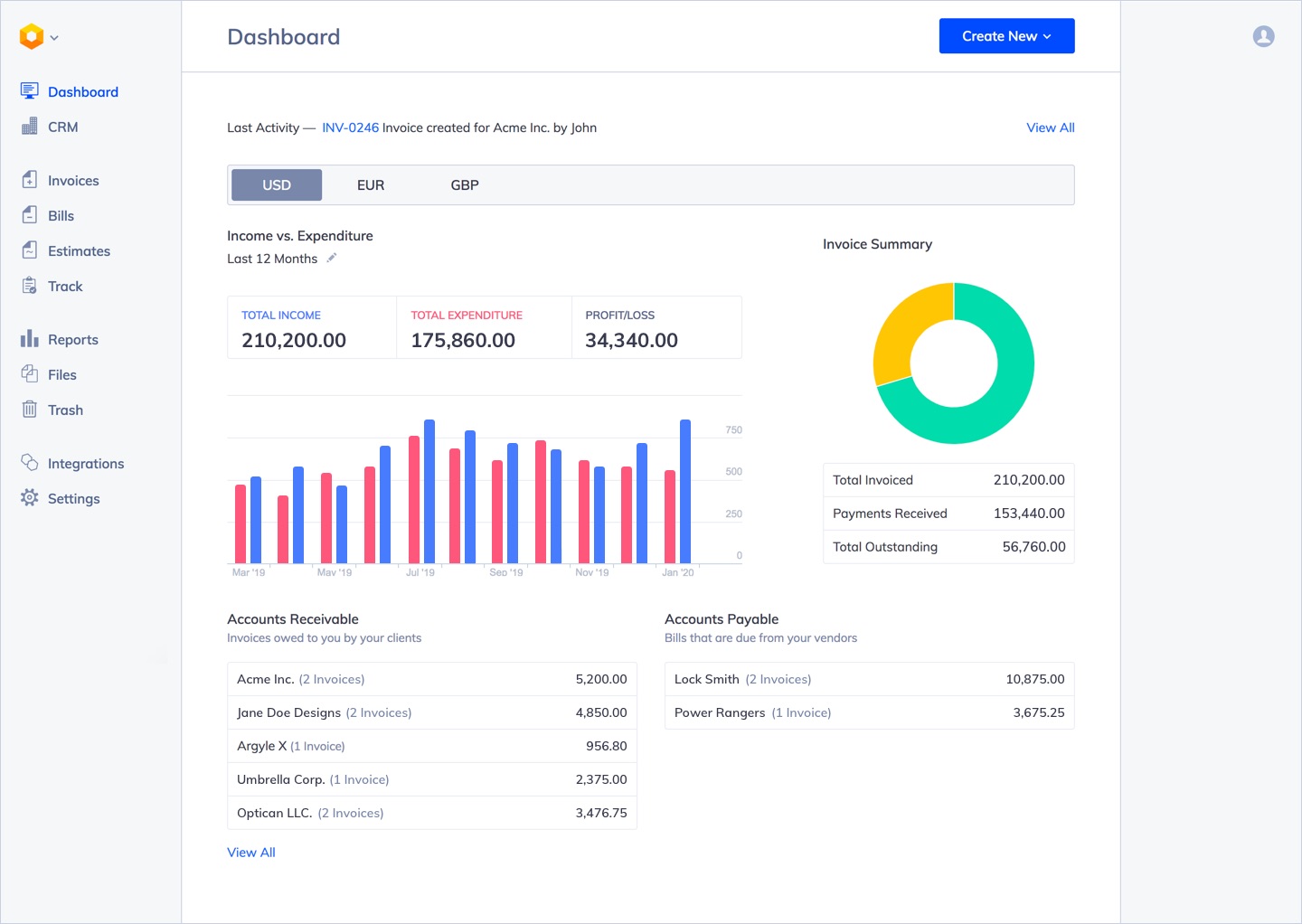
Better Dashboard Reports
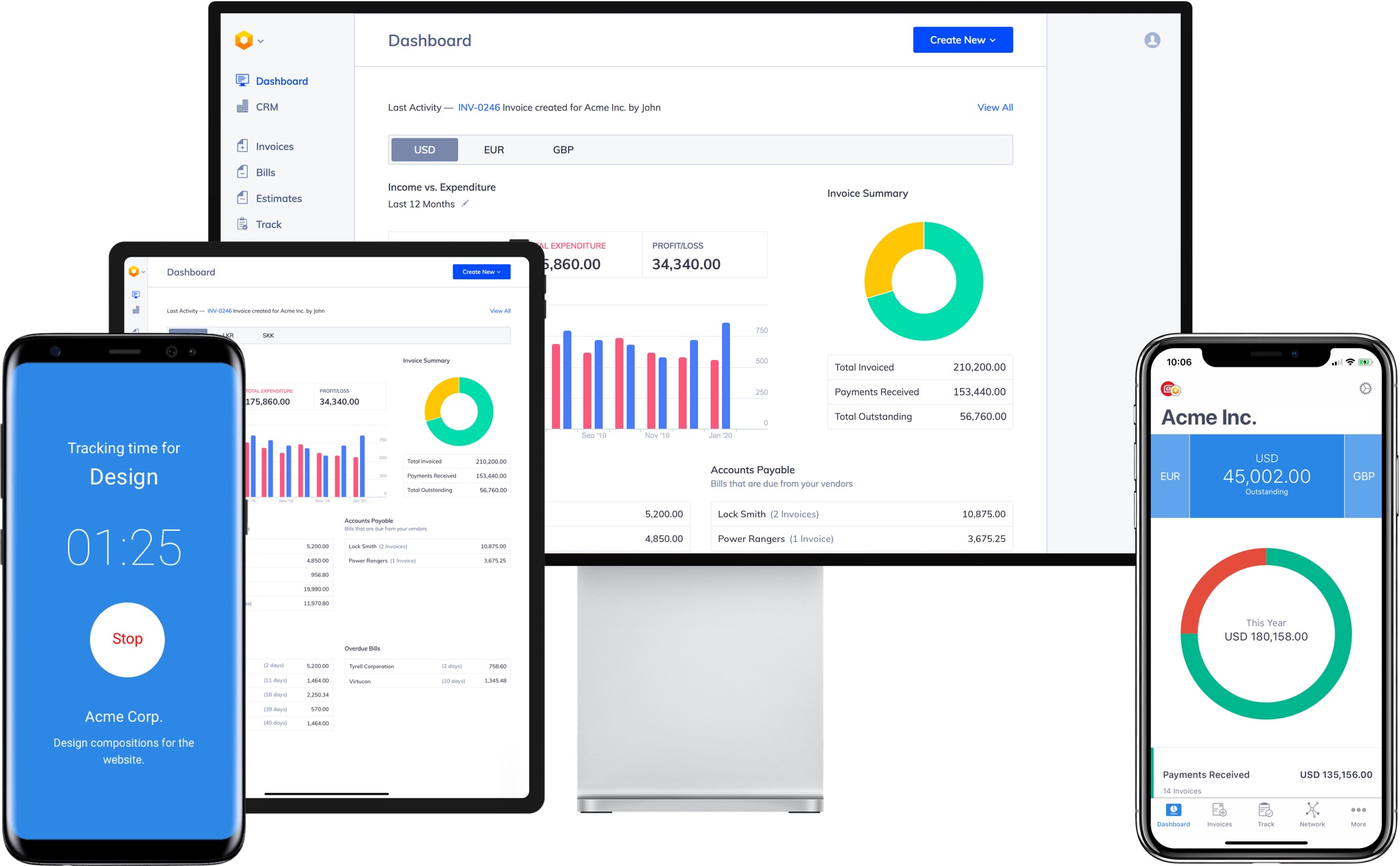
All our customers rely on the dashboard reports to get a quick health check on their businesses. We have simplified things a bit by making the Income vs. Expenditure chart the key element on this page, and made the presentation of data clearer. If you use Bills to track your expenses, the Profit/Loss figure will be shown explicitly. As usual, the charts are clickable, allowing you to drill down for detailed information.
A better way to manage your finances
With Hiveage you can send elegant invoices to your customers, accept online payments, and manage your team — all in one place.

CRM
The old label, Network, has been causing confusion for old and new customers for years, but we weren’t able to come up with an easy solution to a section that included both customers and vendors. This section is now named CRM, and as the label implies, we plan to strengthen it with CRM-like features in the future. This will make managing client and vendor relationships much easier from within Hiveage itself, and also enable easier data integrations and syncing with other tools and services you use.
Integrations
The new Integrations section in the main menu will showcase all our integrations to other services. At the moment these are primarily payment gateways (which have been moved out of the old Upgrade section). One of the key priorities for us this year is to improve our integrations, including more zaps on Zapier, and make more Hiveage functionality accessible through our API.
We have several more improvements to the UI planned in the coming weeks, including an overview of overdue invoices and bills on the Dashboard. As always, please share your feedback and suggestions with us directly through [email protected].
Join thousands of business-savvy entrepreneurs on our mailing list.
Curated emails that’ll help you manage your finances better.


